Blog task9-Vulnerabilities and patches
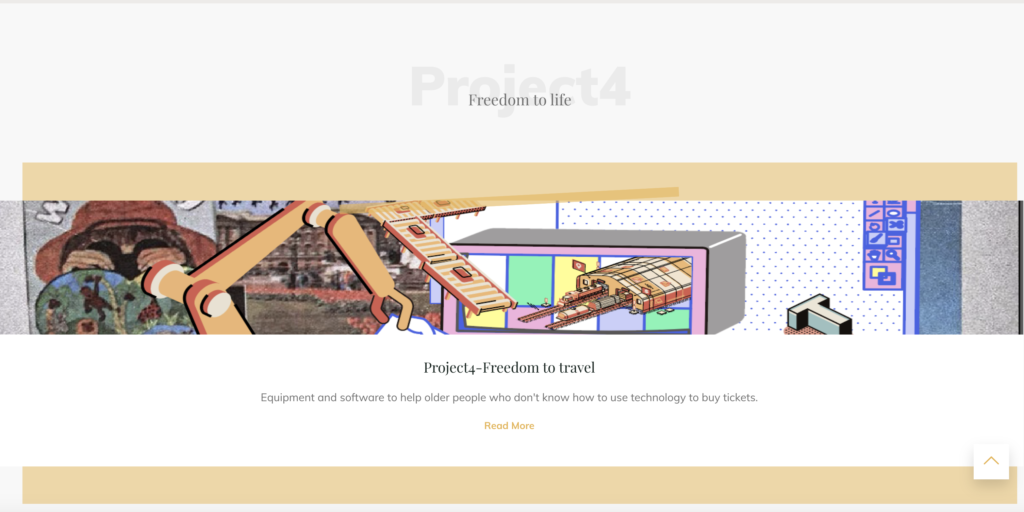
The first impression of the portfolio according to the teacher’s advice is not bad. However, there are some problems with the functionality: 1 There are some problems with the navigation menu, too many jumps and. There is no overall category page which can only be accessed one by one, not in an overview. So I added an overall menu and reduced the number of jumps.2 In terms of content: there was not enough of my own work to show, there should be more of my own drafts or other work. So I added my own work and put in some of my usual designs and drafts.3. There were also some minor issues with findability, some sections were repetitive and should be streamlined. I have reduced the number of sections and reorganised the layout to address this issue. 4 In terms of user experience and readability, the user does not know the specific information about the piece they are clicking on in the linked pages. So it doesn’t engage them very well and lead them to the content they are interested in. I have therefore added detailed information about each piece on the display page. This includes the name of the work, the date it was completed, the content of the work, and what it is trying to say and convey. Overall my portfolio is more like a blog than a collection of my own work. There is a lack of personalisation and presentation of work. The fundamental solution to this problem is to make my portfolio more personal. So that when people see the portfolio they know exactly what my style is and what they associate with me.In addition I have added detailed information about each post as per the teacher’s feedback. Replaced the original theme photos with my own work.


